A B2B SaaS homepage has about ten seconds to answer five questions a buyer does not know they are asking: what is this, is it for me, why should I believe you, what does it look like, and what do I do now. Most homepages we read answer the first one vaguely and skip to a demo button. This guide walks the page in the order a buyer reads it, section by section, and says what each one has to do, what it usually does instead, and what to cut.
It is written from the engagements we run for founder-led software companies in India and the US, and it maps one to one onto the five points our scorecard checks. If you want to see where your own page stands before reading, score it first; the sections below will read differently.
What a homepage has to do in ten seconds
A buyer arrives from a search, a colleague's message or a LinkedIn post. They do not read; they scan for the answer to whatever question sent them. The page has to survive that scan and then reward the reader who stays.
That means the homepage is not a brochure and not a feature list. It is an argument, and an argument has an order: claim, audience, evidence, demonstration, request. When the order is right, a buyer who stops halfway still leaves with the claim and the evidence. When the order is wrong, the buyer leaves with adjectives.
The five decisions a buyer makes, in sequence:
- What is this? A category and an outcome, in one line.
- Is it for me? A named buyer and a recognizable moment.
- Should I believe it? Evidence I can check.
- What does it actually look like? The product, not an illustration of it.
- What do I do now? One next step, and what happens after I take it.
Everything that follows is about one of those five. If a section on your page does not serve one of them, it is a candidate for the cut list at the end.
The first screen: the sentence
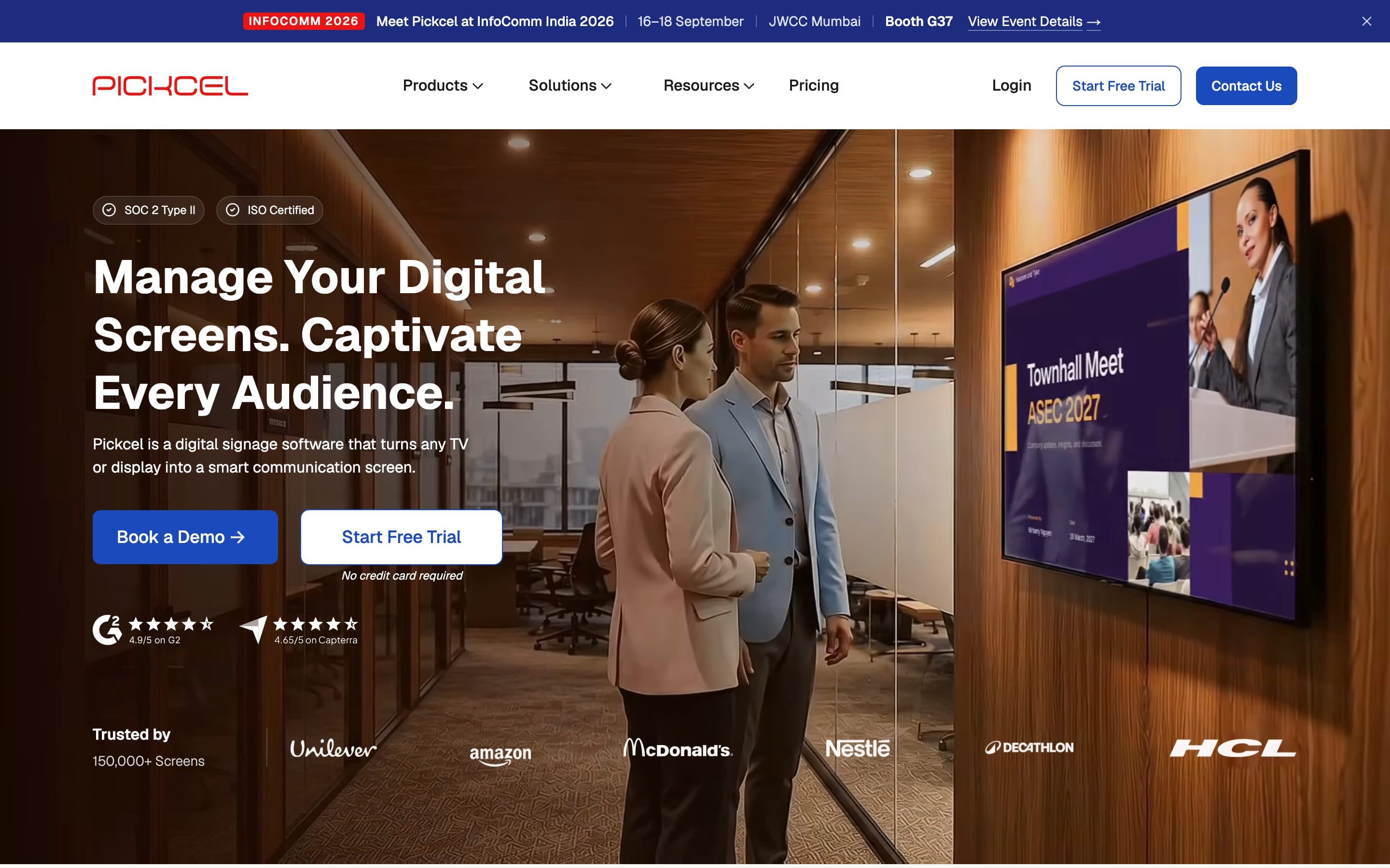
The hero carries one job: say what you sell, to whom, and what changes for them. That is the sentence. It is the single most important line on the site, and it is the one most often replaced with a slogan.
A working sentence has three parts, and a buyer can repeat it after one read:
- The category. What kind of thing this is. "Digital signage software." "A CRM." "An analytics layer for casinos."
- The buyer. Who it is for, named specifically enough that the wrong people self-select out. "For retail chains." "For founder-led studios." "For iGaming operators."
- The change. What is different after they buy. "Every screen updated from one place." "Warm leads that get followed up." "One story for nine models."
Put together: "Digital signage software for retail chains that want every screen updated from one place." Not clever. Checkable. Repeatable.
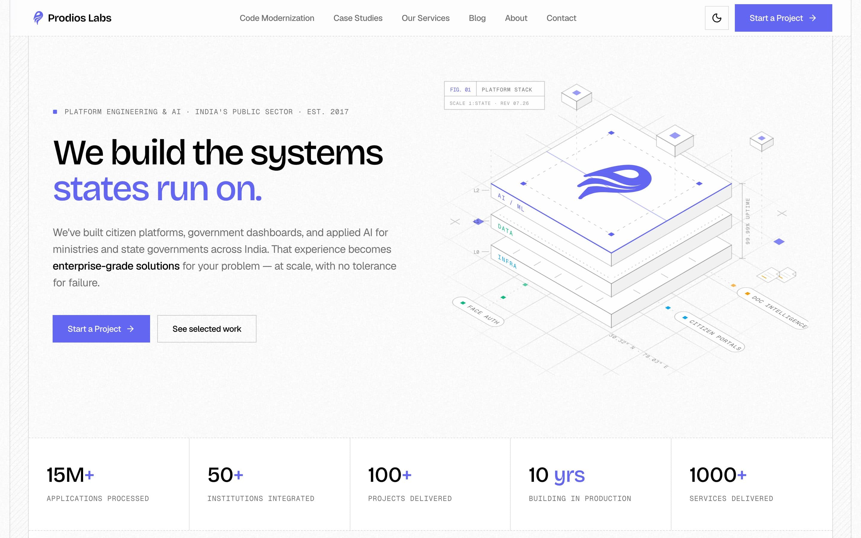
Compare the lines that fail the test, which are most of them: "Better decisions, faster." "The platform for modern teams." "Unlock growth." "Work smarter." Each is an adjective where a claim should be. None names a buyer, so none can be wrong, which is exactly why none of them work. When we reposition a SaaS company, the first two weeks are spent on this line and nothing else, because every section below it is either supporting the sentence or compensating for its absence.
Two tests for any candidate line. The co-founder test: can someone who read it once repeat it to a colleague without looking? The competitor test: could your closest competitor put the same line on their site without changing a word? If the second is true, you have described the category, not the company.
The subhead is where the sentence gets its second clause: the mechanism or the proof. "Runs on the TVs you already own." "Used by 9,000 businesses in 70 countries." One of those, not both, and never a third line.
Who it is for: the ICP block
The hero names the buyer once. The section under it earns the right to have named them, by showing that you know their situation.
The most common failure here is the word "businesses". "Trusted by businesses of all sizes" is a sentence that describes nobody. A buyer reads it and has to do the work of deciding whether they count, and most decide not to bother. The scorecard marks ICP clarity weak when a page addresses "businesses" or "companies" in the first screen and never gets more specific.
The fix is a short block that names the buyer three ways:
- The role. "Founders and heads of marketing at B2B software companies."
- The company. "Seed to Series B in the US, or ₹5 to 50 crore ARR in India."
- The moment. "Whose site was built for launch and never caught up with the product."
That third item, the trigger moment, is the one nobody writes and the one that converts. Buyers do not come looking because of who they are; they come because something happened. A fundraise, a sales hire, a redesign that stalled, a competitor that just raised. Name the moment and the right reader thinks "that is me, this week."
If you sell to more than one buyer, the hero speaks to the primary one and this block, or a set of solution rows further down, speaks to the others. Each row gets its own sentence and its own proof. What does not work is a hero that tries to address three buyers at once; it addresses none of them.
Proof that can be checked
Proof goes before the ask. This is the single ordering rule that changes results most, and it is the one most pages get backwards: a demo button in the hero, and the customer logos three screens down.
Proof is evidence a buyer can verify without trusting you. In rough order of strength:
- Named customers the buyer recognizes. Logos with names, not a wall of grey marks. Six they know beats thirty they do not.
- A number with context. "150,000 screens in 70 countries" says scale. "Admissions inquiries tripled the next intake cycle" says outcome. A number without a noun ("10x faster") says nothing.
- A linked case study. One page per customer, with the problem, the decision and the result. Linked from the homepage, not buried under Resources.
- Third-party review badges. G2, Capterra, Clutch. Useful for US buyers evaluating a shortlist; weaker as first-screen proof.
- Compliance badges. SOC 2, ISO 27001. Not proof of value, but proof you can be bought by a company with a procurement team.
What is not proof: adjectives about yourself ("world-class", "innovative", "trusted"), stock photography of people pointing at screens, and testimonials with a first name and no company.
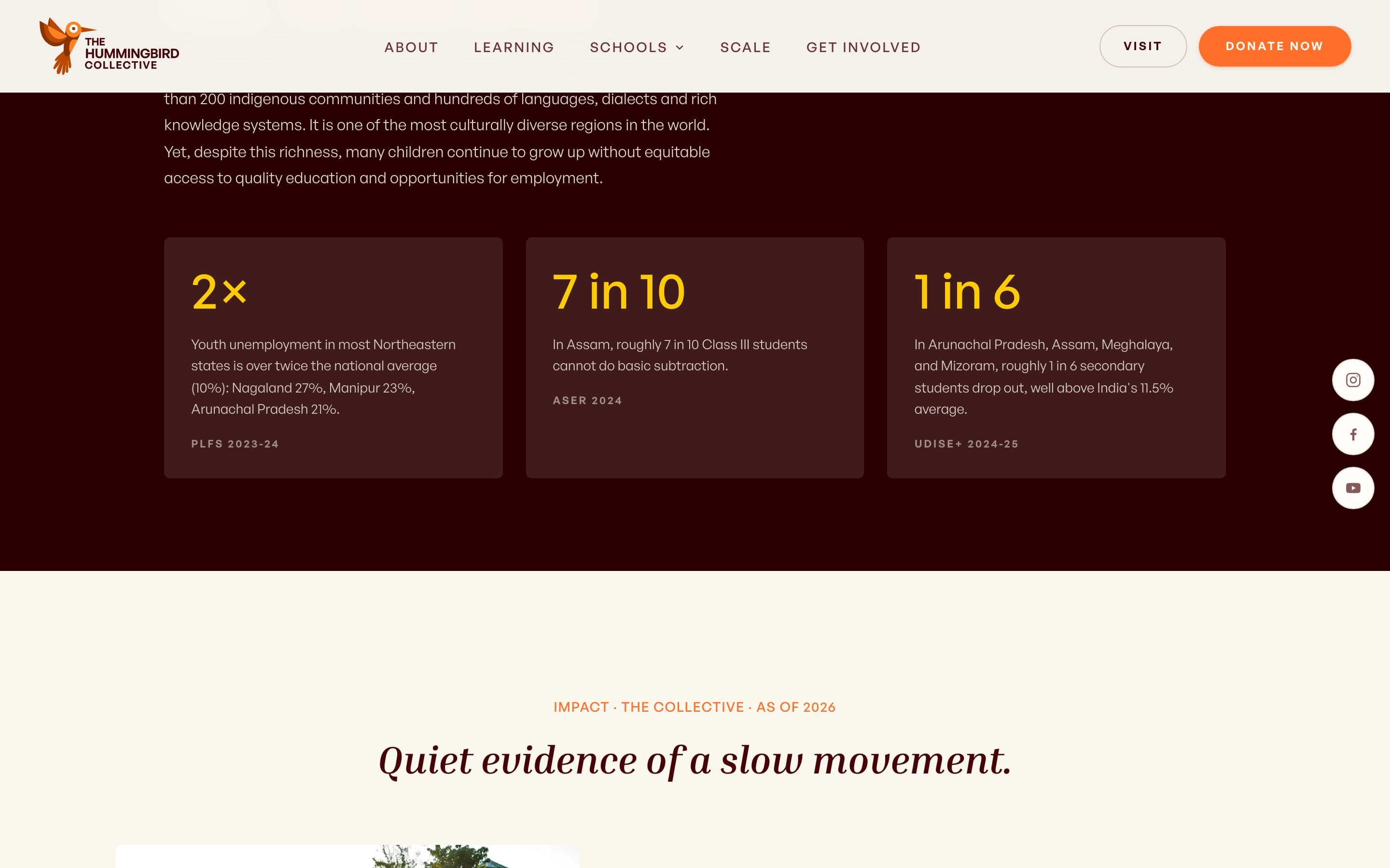
One more rule: the strongest proof point sits inside the first screen, next to the sentence. Not a row of logos below the fold. The one customer name, the one number, the one line from a case study that makes the sentence believable. Everything else can wait for the proof section proper.
The product, shown
After the buyer knows what you sell and has a reason to believe it, they want to see it. Not an illustration, not an abstract gradient with floating cards, and not a video that auto-plays on mute. A screenshot of the real product doing the thing the sentence promised.
This is where many SaaS homepages spend their design budget on the wrong thing. A custom illustration system looks expensive and tells the buyer nothing. A cropped screenshot of the actual dashboard, with one caption explaining what they are looking at, tells them everything and costs an afternoon.
Three ways to show the product that work:
- The hero screenshot. The primary screen, cropped to the part that delivers the outcome, sitting to the right of the sentence or directly below it.
- The three-step strip. "Connect your screens. Publish from one place. See what played." Each step with a real crop. This is the section that replaces "How it works" copy nobody reads.
- The docs-grade surface. For technical buyers, a section that shows the integration or the API as it actually looks. When we rebuilt the Pickcel surface, the solutions and integrations pages were built to be evaluated before the sales call, so procurement stopped asking the same questions on every deal.
If the product is not visually interesting, show the output instead: the report, the dashboard, the message the customer's customer receives. Something real.
How it works, briefly
A short section, three or four steps, between the product and the ask. Its job is to lower the perceived effort of getting started. Its usual failure is length: eight steps with icons, each with a paragraph.
Write it as the buyer's first week. "Day one: connect your data. Day three: your first report. Week two: the team is in it." Concrete time, concrete outcome per step. If getting started is genuinely complex, say so and say what you do about it ("onboarding is done with you, not to you; most teams are live in two weeks"). Buyers trust a specific number more than a promise of ease.
The ask: one path to inquiry
Here is where the page turns into pipeline or into a bounce. The rule is one primary action, one secondary, and nothing else competing.
Most SaaS homepages we score have five to eight calls to action in the first two screens: Book a demo, Start free trial, Contact us, Watch video, See pricing, Talk to sales. Each one is a decision the buyer has to make instead of the decision you want them to make. The scorecard marks path to inquiry partial when it finds more than four.
The structure that works:
- One primary action, phrased as what the buyer gets, not what they do. "See it on your screens" beats "Book a demo." "Score your homepage" beats "Get started."
- One secondary action for the buyer who is not ready. Pricing, a self-serve trial, a guide like this one. It should be lower effort than the primary, not a duplicate of it.
- A form that qualifies. Email alone tells you nothing and tells the buyer nothing about what happens next. Ask what they sell, when they need it, and how they found you. Say exactly when they will hear back. Our own inquiry dialog asks four things and promises a reply within one working day, and it filters the wrong inquiries out before they cost anyone time.
- A visible path to pricing. Not necessarily the number, but the shape: "from $X per seat", "plans for teams of 5 to 500", "scoped after a 20-minute call." The absence of any price signal is the most common reason a qualified buyer does not write.
Measurement: how you know any of it worked
The last point is the one most founders skip and the one that makes every other point fixable. If the page has no conversion event, you cannot tell whether a change to the sentence moved inquiries, or whether the inquiries you get came from search, LinkedIn or a referral.
The minimum that has to exist:
- An analytics tool. GA4 or Plausible. The scorecard checks for one in the HTML and marks measurement weak when there is none.
- One conversion event that fires when the inquiry form or demo request succeeds, marked as a key event so it shows up in reports without configuration.
- Source capture. A field on the form ("how did you find us"), UTM parameters on every link you control, and a weekly ten-minute look at inquiries by source.
- A landing-page view. Which page did the inquiry start on: the homepage, a solution page, a blog post? This is the number that decides what you write next.
None of this needs a data team. It needs one afternoon and the discipline to look at it every Friday. When we build GTM systems, this layer goes in before any distribution, because distribution without measurement is spending without a receipt.
Section order that argues
Put together, the order looks like this. The left column is the section; the right is the buyer's question it answers.
| Section | Buyer's question | What it must contain |
|---|---|---|
| Hero | What is this, for whom? | The sentence: category, buyer, change. One proof point. One primary action. |
| ICP block | Is it for me? | Role, company type, trigger moment. |
| Proof | Should I believe it? | Named customers, a number with a noun, a linked case. |
| Product | What does it look like? | Real screenshots, cropped to the outcome. |
| How it works | How hard is this? | Three or four steps as the buyer's first week. |
| Secondary solutions | I am a different buyer | One row per secondary buyer, each with its own sentence and proof. |
| The ask | What do I do now? | Primary action, secondary action, qualifying form, price signal. |
| Footer | Everything else | Pricing, docs, security, contact, legal. The answers to the questions the page did not need to raise. |
Two notes on the order. Proof appears twice: once inside the hero, once as its own section. That is deliberate; the hero proof earns the read, the proof section earns the click. And the ask appears once at the end, plus the primary action in the hero. Do not repeat the call to action after every section. A buyer who wants to act will scroll up or find the nav; a buyer who does not is only irritated.
Sections you can cut
Most homepages are too long because they contain sections that serve the company, not the buyer. Candidates for removal, in the order we usually remove them:
- The mission statement. "We believe every business deserves…" is for the About page, if anywhere.
- The feature grid. Twelve icons with two words each. Nobody has ever chosen a vendor from a feature grid. Replace with three product screenshots and a link to docs.
- The integrations wall. Two hundred logos. Replace with "works with the tools you already use" and the six logos your buyer cares about, plus a link to the full list.
- The blog feed. Three latest posts on the homepage. They are never the three a buyer needs; they push the ask further down.
- The stats strip with no nouns. "10x. 99%. 24/7." Numbers without context are decoration. Keep the ones with a noun, cut the rest.
- The second and third hero. Some pages restart the argument twice with new headlines. One sentence. Everything else supports it.
- The awards row. Unless the buyer's boss knows the award, it is a row of badges nobody can read.
When in doubt, the test is the buyer's five questions. A section that does not answer one of them is costing you scroll depth and giving nothing back.
The checklist
Run this against your homepage before you brief a designer, an agency or us. Each line is a yes or a no.
- The H1 names a category and a buyer, and could not be pasted onto a competitor's site.
- The first screen contains one piece of checkable proof.
- Somewhere in the first two screens, the buyer's role and trigger moment are named.
- There is at least one screenshot of the real product above the fold.
- There are no more than two calls to action in the first two screens, and one is clearly primary.
- The inquiry form asks what the buyer sells and when they need it, and says when they will hear back.
- A price signal is visible from the homepage.
- An analytics tool is installed and a conversion event fires on inquiry.
- Every number on the page has a noun attached.
- No section exists that fails to answer one of the five buyer questions.
Fewer than six yeses, and the site is a positioning problem before it is a design problem. Start with the sentence. Six to eight, the order and the proof need work, not the visual system. Nine or ten, the homepage is fine; spend the budget on distribution and on the pages below it.
What to do with the result
If the checklist came back short, there are three sizes of fix, and you should pick the smallest one that fits.
The smallest is copy and order: rewrite the sentence, move proof above the ask, cut the sections that serve nobody, add the price signal and the conversion event. Most founder-led SaaS sites can do this in a week without touching the design, and it moves inquiries more than a redesign would.
The middle size is a teardown: a recorded walkthrough of your page against these five points, the sentence rewritten with three candidates, the section order as a one-page outline, and a written brief your team or any designer can execute. Five working days, fixed price, credited if you continue with us.
The largest is a full SaaS website engagement: positioning, structure, design and build from one team, six to ten weeks, and ninety days of measurement after launch. It is the right size when the visual system is working against the argument, when the product has outgrown the site by several versions, or when the company is entering a second market and needs one system across both.
Whichever size, the order of work is the same as the order of this guide. The sentence first. Then the buyer, the proof, the product, the ask, and the measurement that tells you whether any of it worked.