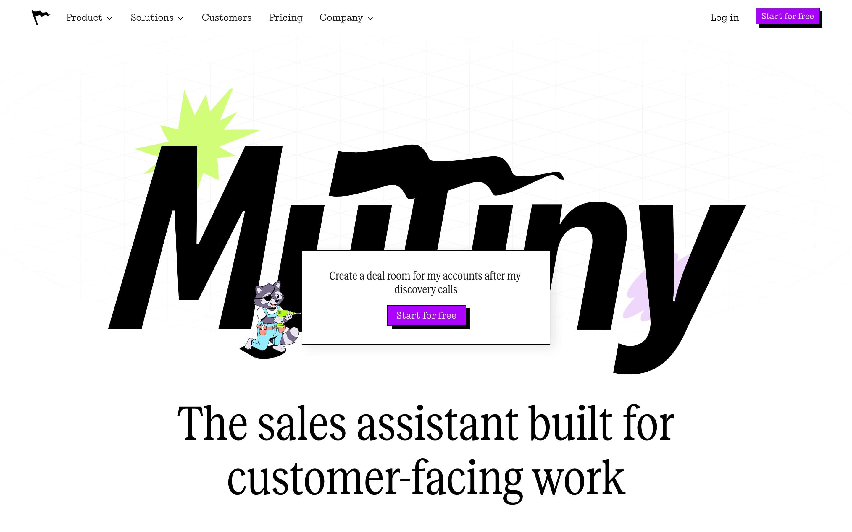
This Mutiny homepage teardown starts where a buyer starts: a giant wordmark, a cartoon raccoon with a power drill, a prompt card that reads "Create a deal room for my accounts after my discovery calls", and a purple button that says Start for free. Then, a screen lower, the headline: "The sales assistant built for customer-facing work."
Mutiny is a Series B company with a customer logo row most Series B companies would trade for. The page is confident, fast and visually its own. It also never tells a sales leader that the product is for them, never shows a number, and asks for the same click eight times. Those are the fixes, and they are cheaper than the design that surrounds them.
We score every homepage on five points: the sentence, the buyer, the proof, the path to inquiry and the measurement. Mutiny scored 6 out of 10 on our scorecard when we read it on 14 September 2026. Here is each point, with the page as evidence.
What the page says
The hero is a brand moment before it is an argument. The wordmark fills the screen, the mascot holds a drill, and the one line of product copy sits inside a prompt card, as if the visitor had already typed it. The headline follows below the fold on a 900-pixel display.
The meta title, which is what appears in a search result and a browser tab, reads "Mutiny | The sales assistant built for customer-facing work." The description under it: "Be the one buyers remember. Join the frontier of how the best enterprise sales teams operate."
Below the hero, in order: a row of seven customer logos, a section headed "Ship quality work on day one" with four video tabs (Break through the noise, Win back hours every day, Start with winning playbooks, Collaborate with your team), a section headed "Ready to use plays for every team" with tabs for Account Executives and Sales Leaders, a "Works with your favorite tools" row, a comparison against generic AI tools headed "Spend time closing, not tinkering", and a closing banner: "Be the one buyers remember. Get the power of a full GTM team in your pocket. Start for free."
That is a complete page. The argument inside it is what needs work.
1. The sentence: a category without a buyer
"The sales assistant built for customer-facing work" does one of the three jobs a homepage sentence has to do. It names a category: a sales assistant. It does not name a buyer, because "customer-facing work" describes an activity, not a person, and it does not name a change, because nothing in the line says what is different after you use it.
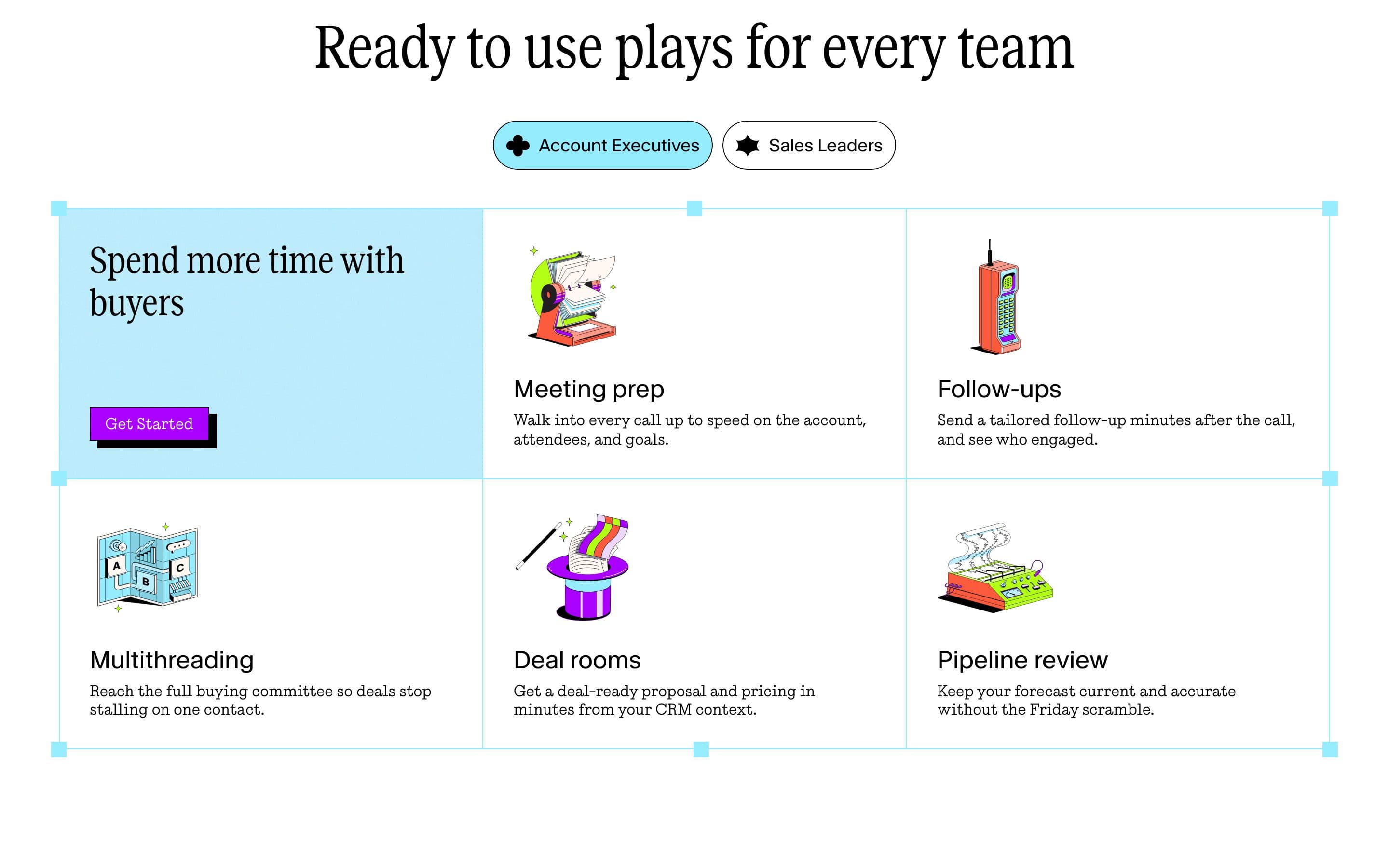
Read the rest of the first screen for help and you find "Create a deal room for my accounts after my discovery calls", which is a feature phrased as a prompt, and "Start for free", which is a request. The buyer and the outcome are on the page, but they are four screens down, in the plays section: account executives who want to spend more time with buyers, sales leaders who want a forecast they can trust.
The competitor test is the quickest way to see the gap: could another AI sales product paste "The sales assistant built for customer-facing work" onto its homepage without changing a word? Yes. That means the line describes the category Mutiny is in, not the company.
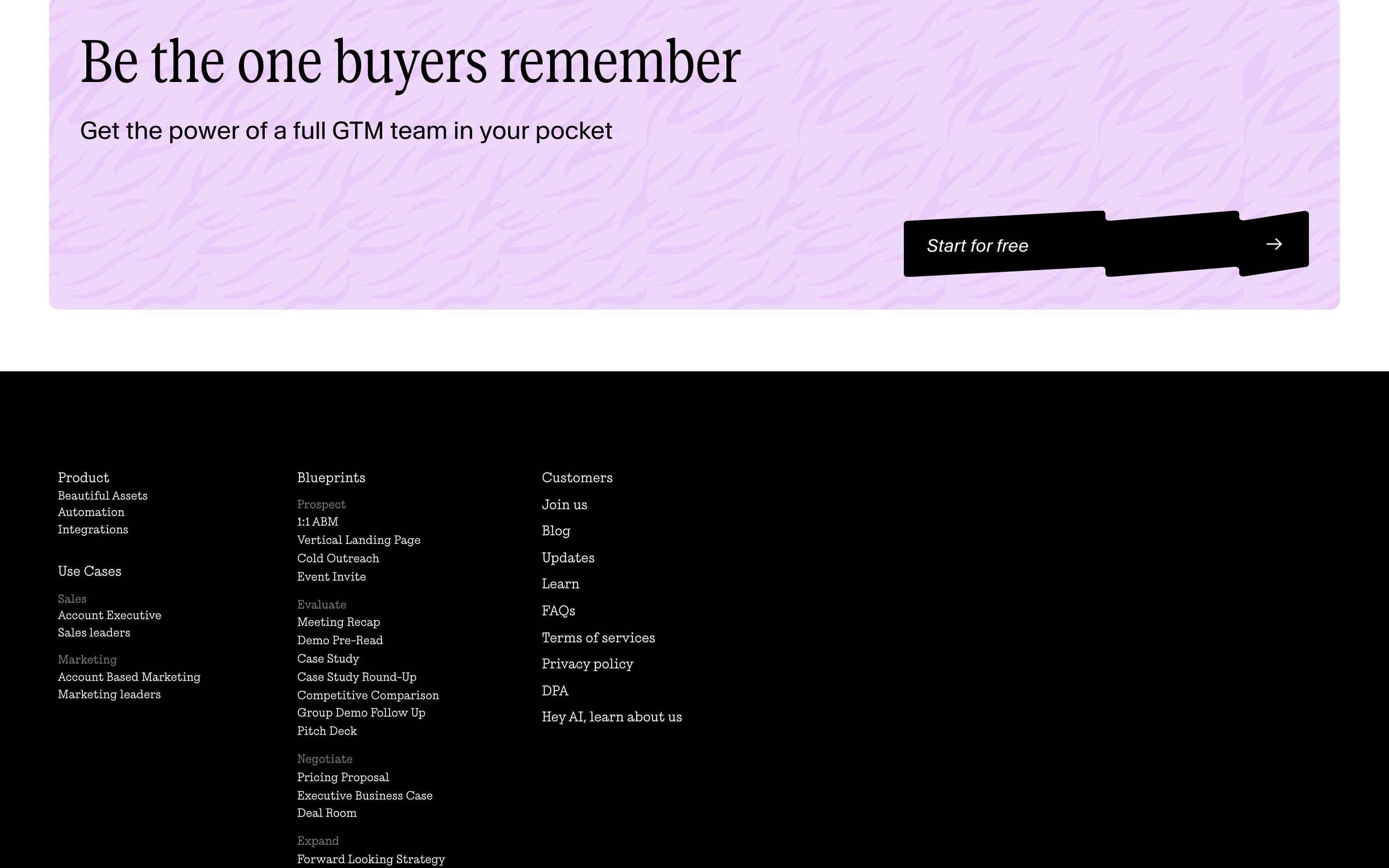
For contrast, the closing banner is closer to a sentence than the headline is. "Get the power of a full GTM team in your pocket" at least names a change. It is at the bottom of the page.
2. The buyer: named in the tabs, not in the hero
Mutiny knows exactly who it sells to. The plays section has two tabs, Account Executives and Sales Leaders, and each play is written in the buyer's own vocabulary: "Walk into every call up to speed on the account, attendees, and goals." "Keep your forecast current and accurate without the Friday scramble." That is good ICP writing.
It is also the fourth section on the page. A sales leader who lands from a LinkedIn post reads a headline about customer-facing work, a logo row, and a tabbed video section about shipping quality work, before the page tells them it was built for people like them. Most will not get there.
The fix is not new copy. It is moving copy that already exists. One line under the headline, "For account executives and sales leaders at companies that sell enterprise deals", puts the buyer in the first screen and lets the plays section do what it does now: prove the claim in detail.
3. Proof: seven logos and nothing a buyer can check
The logo row is real proof, and it is above the fold on most screens: Snowflake, Resolve.ai, Atomicwork, Wunderkind, 1mind, 30 Minutes to President's Club, Airwallex. A buyer in B2B sales recognizes at least three of those. That is worth more than most of what follows.
What follows is nothing. We read the full page and found no number with a noun attached, no customer quote, no linked case study and no review badge. The only figures our scorecard picked up were video timestamps. For a product whose entire promise is that reps close more, the absence of a single "reps using Mutiny did X" line is the loudest thing on the page.
The Customers link in the nav suggests the case studies exist. They are one click away from a page that never mentions them. The fix is one line of evidence in the hero, next to the sentence, and one linked case study card before the plays section. Not a testimonial wall; one thing a skeptical VP of Sales can click.
4. The path: eight asks, six of them identical
Count the calls to action in the first two screens: Start for free in the nav, Start for free in the hero card, Log in, Pricing, then Get Started in each of the plays tabs, and Start for free again in the closing banner. Our scorecard found eight. Six are the same action with the same label.
Repetition is not the problem by itself; a long page can restate its primary action. The problem is that there is no secondary path for the buyer who is not ready to start a free trial. A sales leader evaluating tools for a team of forty does not start for free; they want pricing, a case study, or a conversation. Pricing exists, in the nav, with no signal on the page about what it looks like. There is no "talk to us" and no "see it on your accounts."
Two changes. First, one secondary action in the hero for the leader-buyer: "See pricing for teams" or "Book a walkthrough." Second, a price signal near the primary action ("free for individuals, team plans from $X per seat", or whatever the true shape is), so the qualified buyer does not have to leave the page to find out whether this is for a rep or for a revenue org.
5. Measurement: in place
Credit where it is due. The page loads Google Tag Manager, Microsoft Clarity and HubSpot. Someone can see where visitors come from, what they do, and which of the six buttons they press. Whether a conversion event fires on trial signup and whether source is captured we cannot see from outside, but the tooling is there, which is more than half the pages we score can say.
This matters for the rest of the teardown: every change above can be measured. Change the headline, watch trial starts by landing page for two weeks, keep it or revert it. Without this layer the other four points would be opinions. With it they are experiments.
What we'd change first
One thing, before any redesign: the sentence, with a proof point beside it.
The headline names a category. The buyer is four screens down. The proof is a logo row with no number. All three problems live in the first screen and all three are copy. A founder-led team could ship the fix in an afternoon and read the result in Clarity by the end of the month.
If the sentence changes and trial starts do not move, the problem is further down and the plays section is the next place to look. If they do move, the second change is the secondary action for sales leaders, because the page currently converts individual reps and quietly loses the person who signs for the team.
The sentence, rewritten
Under it, one proof line: the strongest number from a case study, or if there is no number yet, "Used by sales teams at Snowflake, Airwallex and Atomicwork." Then the plays section can stay exactly where it is.
What Mutiny gets right
A teardown that only lists faults is not useful, so: the brand is unmistakable and the illustrations are its own, which is rarer than it sounds. The plays section is a model of buyer-vocabulary writing. The comparison against generic AI tools ("Require GTM engineers" versus "No setup required") is the kind of honest, specific contrast most SaaS homepages avoid. The footer's Blueprints column, a list of the actual assets the product produces (1:1 ABM, Demo Pre-Read, Pricing Proposal, Executive Business Case), is more concrete than the hero. Moving two of those lines up would fix half of this post.
That is usually how it goes. The material for a strong homepage is on the page. It is in the wrong order, and the sentence at the top has not been written yet. If that describes your site, the guide to the B2B SaaS homepage walks the order section by section, and the scorecard will tell you in a minute which of the five points to start with.