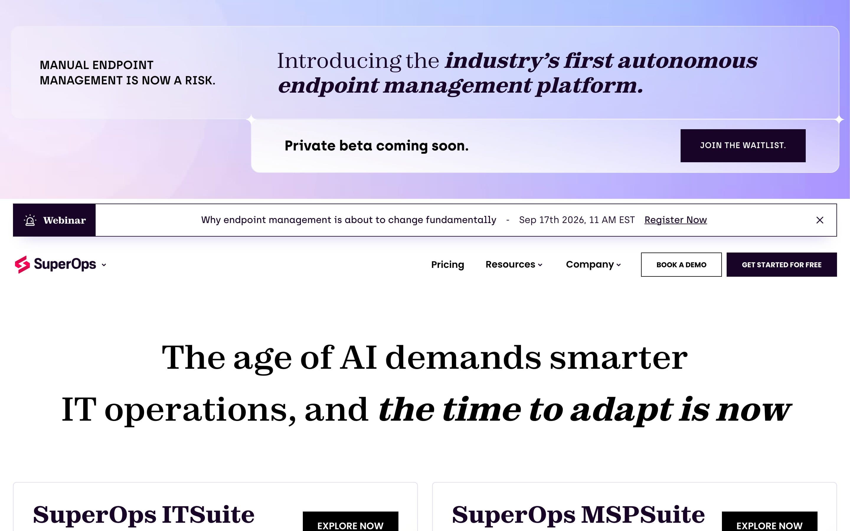
This SuperOps homepage teardown is about a page that has almost nothing on it, which makes it unusually clear. SuperOps builds an IT operations platform for managed service providers and in-house IT teams, sells it from Chennai to a largely US market, and has raised enough to be a name in its category. Its homepage, read on 14 September 2026, has 137 words of copy, no H1, no customer, and seven buttons.
That is not a design failure. The two product cards that make up the body of the page are clean, the screenshots are real, and the buyer is named correctly inside them. It is a positioning failure, and specifically a sequencing one: the page has the right pieces and puts the least useful ones first. Our scorecard gave it 5 out of 10. Here is each point, with the page as evidence.
What the page says
The first screen is an announcement panel: "Manual endpoint management is now a risk. Introducing the industry's first autonomous endpoint management platform. Private beta coming soon. Join the waitlist." Under it, a webinar bar with a date and a Register now link. Then the nav: Pricing, Resources, Company, Book a demo, Get started for free.
Then the largest text on the page, set in a serif display face: "The age of AI demands smarter IT operations, and the time to adapt is now."
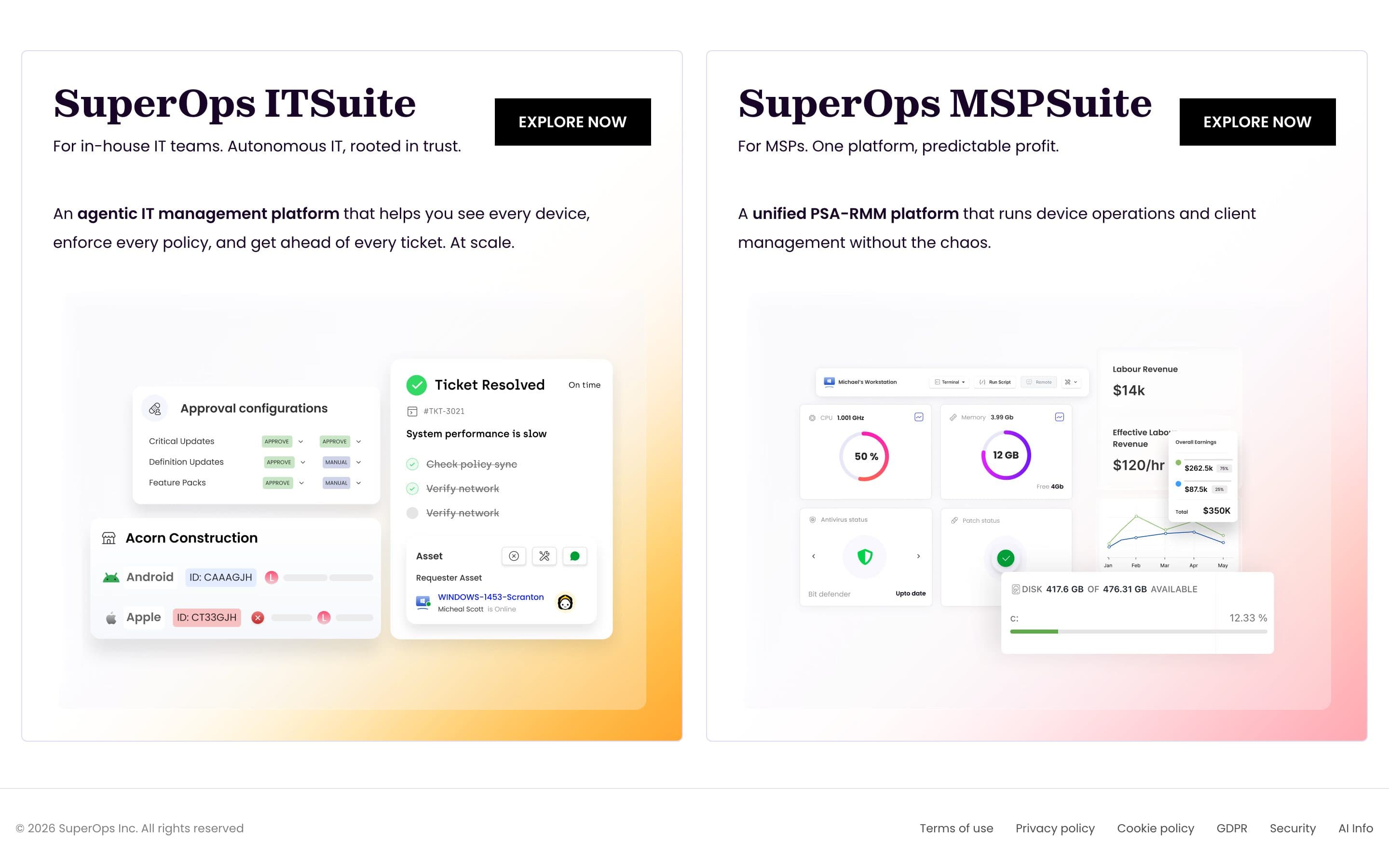
Then two cards side by side. SuperOps ITSuite: "For in-house IT teams. Autonomous IT, rooted in trust. An agentic IT management platform that helps you see every device, enforce every policy, and get ahead of every ticket. At scale." SuperOps MSPSuite: "For MSPs. One platform, predictable profit. A unified PSA-RMM platform that runs device operations and client management without the chaos." Each card has a product screenshot and an Explore now button.
Then the footer. That is the entire homepage.
1. The sentence: a slogan where the claim should be
There is no H1 on the page. The line doing the H1's job visually is "The age of AI demands smarter IT operations, and the time to adapt is now." Read it with the three-part test: does it name a category, a buyer, and a change? It names none. It is a statement about the era, not about the product, and it could sit on the homepage of any company that sells anything to IT.
The strange part is that SuperOps has already written the sentence. It is in the meta title: "Autonomous IT operations platform for MSP and IT teams." Category, buyer, done. A search result shows a better headline than the page does. The description tag goes further: "One autonomous platform to manage endpoints, automate service delivery, and scale IT operations, built for MSPs and IT teams." That is a homepage hero, hiding in the head of the document where only Google reads it.
The fix is to promote it. Put the meta title's sentence in an H1 where the slogan is, add the change ("so a team of five runs like a team of fifteen", or whatever the true number is), and let the slogan go. Nobody chooses an RMM because the age of AI demands it.
2. The buyer: named correctly, three screens too late
Once you reach the product cards, the buyer writing is good. "For in-house IT teams." "For MSPs." Two audiences, two cards, each with a one-line promise ("Autonomous IT, rooted in trust"; "One platform, predictable profit") and a one-sentence description in the buyer's vocabulary. PSA-RMM means something specific to an MSP owner, and the page uses it without apology. That is the right call.
The problem is what stands between the visitor and those cards: a private beta announcement for a product they cannot use yet, a webinar promotion, and a slogan. An MSP owner arriving from a search for RMM software reads three things that are not for them before reaching the one that is.
Two moves fix this without new copy. Swap the order so the two cards, or a one-line version of them, sit directly under the new H1. Move the beta announcement to a slim bar below the fold, or to a line inside the ITSuite card where the people who care about autonomous endpoint management will find it. The webinar bar can stay in the nav strip; it should not be the second thing on the page.
3. Proof: none on the page
We read the page twice looking for a customer name, a number with a noun, a quote, a review badge or a case study link. There is none. The scorecard found only compliance references in the footer's Security and GDPR links. For a company with paying MSPs across several countries, the homepage presents as if it had launched last month.
This is the cheapest fix on the list and the one with the largest effect, because proof is what turns a good sentence into a believed one. One row of six customer logos an MSP owner would recognize, or a single line like "Trusted by 1,000+ MSPs" if that is true, placed directly under the H1. One linked case study with a number in the title ("How X cut ticket time by Y") between the product cards and the footer. The product screenshots already do the "what does it look like" job; proof is the missing "why should I believe it."
For an Indian company selling to the US, this matters twice. A US buyer evaluating an unfamiliar vendor is looking for a reason to trust it. Named customers in their own market are that reason, and the page currently offers none.
4. The path: seven asks for 137 words
Join the waitlist. Register now. Book a demo. Get started for free. Explore now. Explore now. Pricing. Seven actions on a page with fewer words than this section, and no hierarchy among them. The two in the nav are the ones the business presumably wants (demo for MSPs, free start for IT teams), and they are the two smallest elements on the screen. The largest button belongs to a private beta.
A buyer who has decided this might be for them faces a decision the page should have made for them: which door? The right structure for a two-audience page is one primary action per audience, inside the card that speaks to that audience, and nothing competing above them. "Book an MSP demo" in the MSPSuite card. "Start free" in the ITSuite card. Pricing linked from both. The waitlist becomes a text link inside the announcement, not the page's largest button.
There is also no price signal anywhere on the page. Pricing is a nav link; the page itself gives no shape ("per technician", "per endpoint", "from $X"). An MSP owner's second question after "what is it" is "what does it cost per tech", and the homepage should answer it in one line, even if the number lives on the pricing page.
5. Measurement: the tag manager is there, the events probably are not
The page loads Google Tag Manager and nothing else we could detect. That is enough to measure everything above, if a conversion event fires on demo requests and trial starts and if source is captured. From outside we cannot tell. The absence of any other analytics (no product analytics, no session recording, no CRM script on the homepage) suggests the marketing site is not being read closely, which would also explain how the meta title and the H1 drifted apart.
The reason this point matters here: every fix above is reversible and cheap. Promote the sentence, move the cards up, add one proof line, cut to two primary actions. Run it for a month. If demo requests by landing page do not move, revert. Measurement is what makes a teardown a plan instead of an opinion.
What we'd change first
The H1. Take the sentence from the meta title, add the outcome, and put it where the slogan is. Then, in the same afternoon, move the two product cards up under it and add one line of proof between them and the headline.
That is three changes and no design work, and it turns a router page into a homepage. The beta announcement, the webinar and the five extra buttons can be dealt with the following week, once the first change has a number attached to it.
The sentence, rewritten
Under it, one proof line. Then the two cards. Then a case study. Then the footer. The page would be about as short as it is now, and it would be complete.
What SuperOps gets right
The two product cards are genuinely good: named buyers, real screenshots of a real product, one-line promises in the buyer's vocabulary, and no feature grid. The meta title and description are better positioning than most SaaS companies manage on their actual page. The product suite names (ITSuite, MSPSuite) make the two-audience structure legible at a glance. And the page is fast and free of clutter; there is no twelve-icon feature grid to remove, no mission statement, no blog feed.
Which is the point of this teardown. The material for a strong homepage is on the page and in the document head. It is in the wrong order, the largest line is the weakest one, and there is no proof. Those are copy and sequence problems, and copy and sequence problems are the ones a founder can fix this week. If your homepage looks like this from the outside, the guide to the B2B SaaS homepage walks the right order section by section, and our positioning work is what we do when the sentence has never been written.